
Pagani Design PD-1701 Review: Omega CK2998 Homage
Explore our in-depth review of the Pagani Design PD-1701 chronograph, a stunning homage to the vintage Omega CK2998 Moon Watch. Discover its features, design, and performance in detail.
CHRONOGRAPHPAGANI DESIGN
4/27/202610 min read

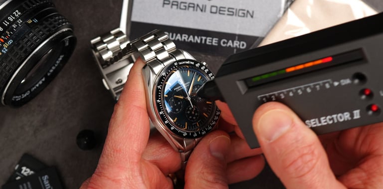
When I saw the renders of this $90 thing, well… I thought — yeah, nice try, guys. Nice renders… looks great on the screen. Let’s see what the real thing looks like. And… yeah — I was in for a bit of a shocker.
Now, what we have here is the latest version of Pagani Design’s very popular series — and this time, it is a tribute to a tribute. It goes back to the CK2998 — the one that was actually the first Omega worn in space by astronaut Wally Schirra. Not on the moon — but still… the first Speedmaster up there - in space...
So the question is — does that bring Pagani Design back as the king of the budget homages? Because… just heads up — I think it actually might. But hey — we’ve got it here. Let’s find out.
...
Design
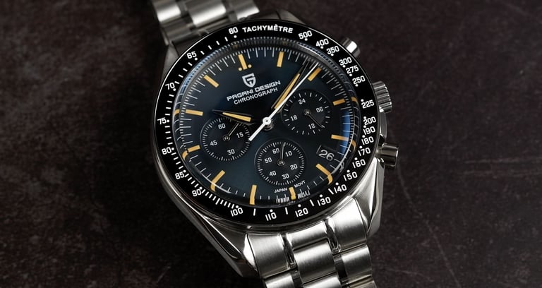
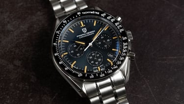
Now, looking into the design of this one. So yes — this is another iteration of what seems to be a very popular series from Pagani Design. And I think this is just another way of them reasserting their position in this space — whether you want to call them a budget homage maker or a budget microbrand. Because there’s a lot of competition creeping in now. You’ve got Watchdives, Addiesdive, and a bunch of other brands that have appeared over the past couple of years — even months.
So yeah, Pagani Design is clearly doing what they can to keep that competition at bay.
And with this one, they’ve very much taken the approach of — if it’s not broken, don’t fix it. Because visually, there’s very little change compared to the previous versions. Now, if you remember the version that I reviewed before — that one actually had a sapphire bezel insert, along with a box sapphire crystal.
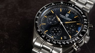
This time, they’ve gone with a ceramic bezel insert for that black tachymeter scale — which, so looks very good and still maintains a high level of scratch resistance.
And we still have that boxed sapphire crystal, which looks fantastic. It really gives off that slightly vintage, Hesalite-style look — just hitting all the right notes for this kind of design. And that’s not easy to do at this price point.
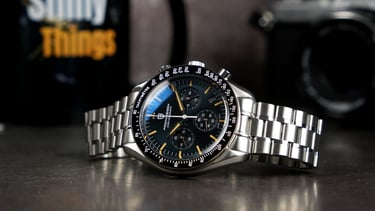
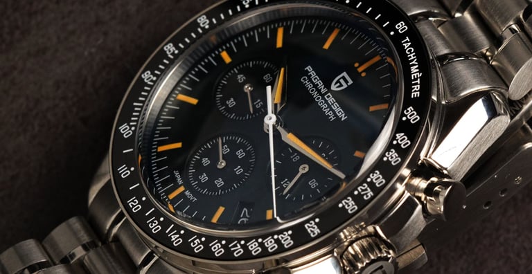
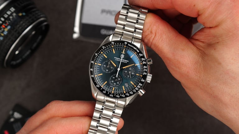
Now, the big change here, of course, is the dial — and honestly, I think they’ve done an excellent job.
Because in person… this thing looks really good. Everything just feels like it’s been done exactly how it should be.
One detail I really like — and I actually had to do a double take to notice — is the date window. It’s tucked away between four and five o’clock, and it’s done really cleanly. And if you didn’t spot it straight away… that kind of proves the point. And I like that — it adds a bit of practicality without completely ruining the layout, even though, of course, the original Speedmaster doesn’t have a date.
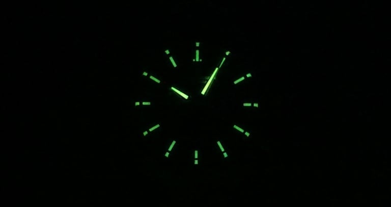
Now, they also didn’t cheap out on the hands. There’s a bit of faceting going on there — nicely finished, filled with lume, and the lume colour matches the indices well. And then there’s the dial surface itself…
I don’t know how they’ve done this at this price point, but it’s got this really complex texture — kind of a dark, slightly blue-green, vintage-leaning tone with a subtle sunburst effect. And it just looks fantastic.
Honestly, it’s one of those things that’s a bit hard to believe until you see it in person.
Everything else, as I just mentioned, is largely carried over. Now, there are a couple of things I’ve criticised on previous versions — and we’ll go into those in more detail in a moment..
As for the case finishing — I think this is where the economies of scale starts to show. I believe it would have been more challenging to get this such a decent quality of case finishing on a smaller production runs, definitely not at the price of this chronograph.
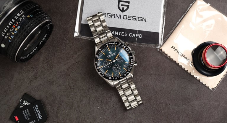
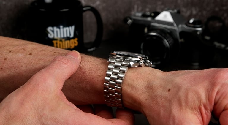
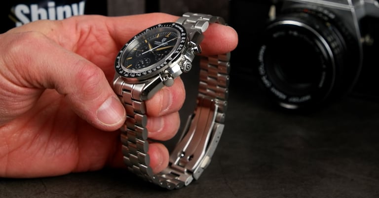
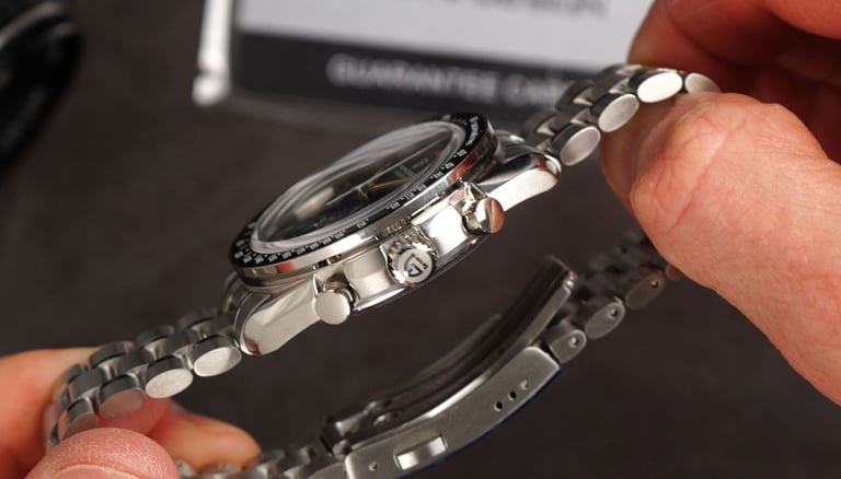
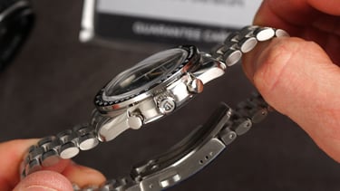
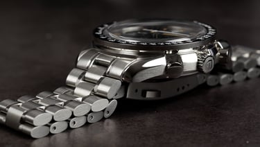
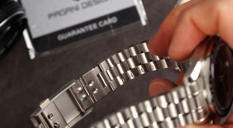
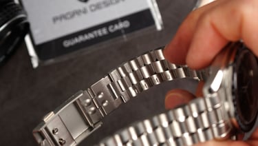
Now, one thing they haven’t followed is the exact bracelet style you’d expect if you’re thinking about the CK2998. That vintage Omega reissue has a flat link style bracelet. But to be honest… I actually quite like this bracelet, and with 20mm lugs there is always an option to put on a strap for that more authentic 1960s look.
Ok this bracelet doesn’t feel super luxurious — it is a bit on the lighter side — but the finishing is very decent, it looks good, and it just works well with the watch overall.
Dimensions
Right, let’s quickly run through the dimensions. Now, this one is very much sticking to the script.
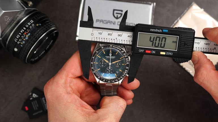
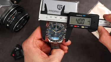
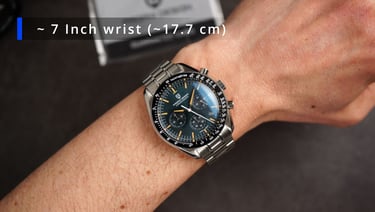
Starting with the case diameter — we’re looking at 40 millimetres on the bezel, which is really what defines the visual size of the watch. The actual case is ever so slightly larger, coming in at around 41 millimetres, maybe just pushing towards 42 — but again, visually, it wears like a 40. We’ve got 20 millimetre lug width, so yeah — strap monster potential with this one. Plenty of options to play around with. The bracelet itself tapers down nicely to about 18 millimetres at the clasp.
Now, measuring the thickness — we’re at around 14.1 to 14.2 millimetres. But a good portion of that is coming from that boxed, double-domed sapphire crystal — I’d say roughly around a millimetre and a half, maybe even a bit more. So visually, the mid-case doesn’t feel overly chunky.
Lug-to-lug comes in at just under 48 millimetres. And since we’ve got inverted end links, that’s your true measurement — no need to second guess. If you include the effective span across the bracelet, you’re looking at around 49.3 millimetres. So overall, a very wearable set of proportions. And finally, weight — this one comes in at around 120 grams on the supplied bracelet.
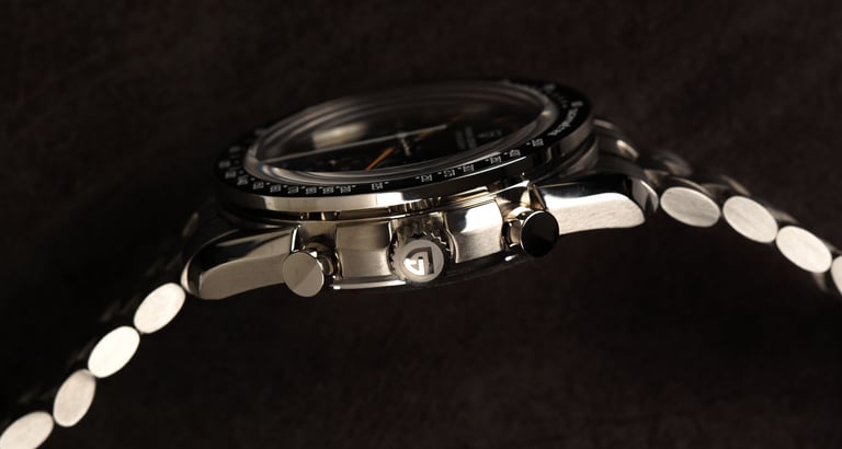
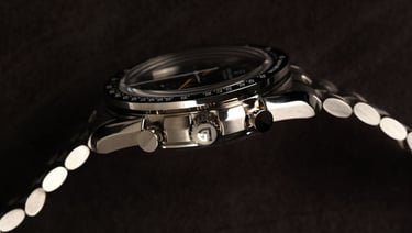
Case
Now, looking at the case — and as I already mentioned — we do have a very decent level of finishing here.
Of course, we’ve got those very familiar twisted lugs that come with this type of design. Nice transitions, with polished chamfers and brushed surfaces working together really well.
On top, we have a fixed bezel with a ceramic insert and full tachymeter scale. That’s framed by a high-polished stainless steel ring, and overall, the proportions are nicely balanced. So yeah — definitely no complaints here.
Now, moving over to the right-hand side of the case — there are no traditional crown guards, but the case itself is slightly asymmetrical. The right side protrudes a bit more, which effectively gives you that built-in protection for the crown and pushers. Speaking of which — we’ve got pump-style pushers and a screw-down crown. Now, the screw-down crown… I’m not entirely sure it’s strictly necessary here. But given this is a quartz movement — we’re not winding anything so we don't have to engage with the crown too often. It does add a bit of extra dust and moisture protection, even so, realistically, with standard piston pushers like these, this isn’t going to be the most watertight chronograph out there. But that just comes with the territory. The crown itself is signed, has nice knurling, and is easy to grip. The pushers are highly polished and look very good. Pagani Design, quite optimistically, declares 100m of water resistance on this chronograph. So it should be OK with hand washing and splashes but generally I would advise keeping this one away from the water.
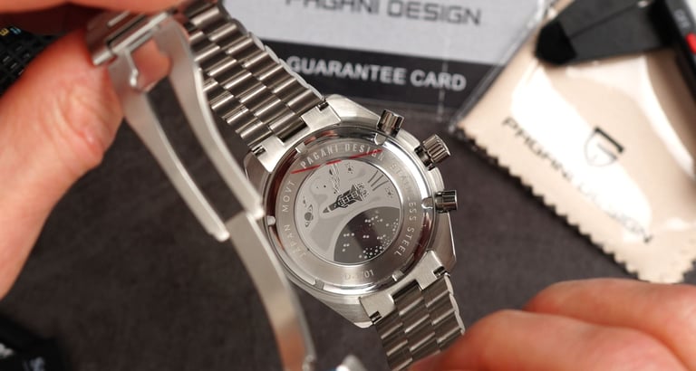
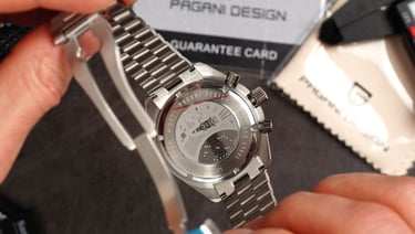
Now, flipping the watch over… and we’ve got that familiar space motif. And yes, I think it’s fair to say it does look a bit like a kid’s drawing… and I’m definitely not the only reviewer who’s said that. At this point — version six — maybe it was time for a slightly more refined update… but clearly, it’s stayed. Still, it is a solid screw-down caseback, fairly flat, and combined with the overall 316L stainless steel construction, it does help the watch sit comfortably on the wrist.
Crystal
Now, moving on to the crystal — And yeah, we’ve got a boxed sapphire crystal here.
It’s not overly tall, which is actually a good thing — it suits the overall aesthetics really well.
You still get a nice level of distortion at the edges, which again just hits all the right notes for this kind of vintage-leaning design. There’s also a decent amount of anti-reflective coating, and overall, it just looks as good in real life as it does in the pictures.
Dial & Lume
Alright, now zooming onto the dial and the execution is very solid.
I mean, this is version six — and you can really say, this watch is pretty much all about the dial. Maybe a bit of the crystal as well, but this is where most of the magic is happening. And they’ve hit all the right marks.
Now, in terms of layout — you’re probably very familiar with what we have here.
At 3 o’clock, we’ve got everyone’s favourite, quote-unquote, 24-hour indicator.
At 6 o’clock, we have the running seconds.
And at 9 o’clock, we’ve got a 60-minute chronograph accumulator.
And of course, the central chronograph seconds hand.
Now, beyond the layout, what I really like here is the execution.
There’s a nice sense of depth — this isn’t one of those cheap, flat, boring dials. The sub-dials are slightly recessed and have a very subtle circular pattern, for a bit of additional visual interest.
The date window is colour-matched, which helps it almost disappear into the dial. If you didn’t know it was there, you might genuinely miss it at first glance — and I think that’s done really well.
Now, originality… yeah, okay — big question mark there. But the execution, especially for the money, is genuinely impressive.
Now, in terms of lume —
It’s… okay. The applied hour markers and hands have it. Pagani Design has never really been known for outstanding lume, and this is pretty much in line with that. It’s usable, it’s there — but it’s not going to compete with some of the stronger performers in this price bracket. And if there’s one area they could still push a bit further, it’s probably this.
Bracelet and Clasp
In terms of the bracelet - well It’s… decent. It looks really good.
I do like this multi-finish approach — you’ve got those subtle high-polished elements alongside the brushed links, which just adds a bit of flair and a bit of finesse to the overall look.
It is a solid stainless steel construction, but yeah — it does feel slightly on the lighter side. It doesn’t quite feel as premium as the case, even though visually, it still holds up very well.
In terms of comfort — no issues at all. It’s a very comfortable bracelet, plenty of articulation, and the links are connected with pins, which is perfectly fine at this price point.
We’ve got solid links, solid end links, and importantly, inverted end links, which really help with the fit.
Because let’s be honest — this isn’t a tiny watch.
So those inverted end links definitely help it sit better on smaller wrists. I’d say this could comfortably work on something around six and a quarter inches, maybe even slightly smaller.
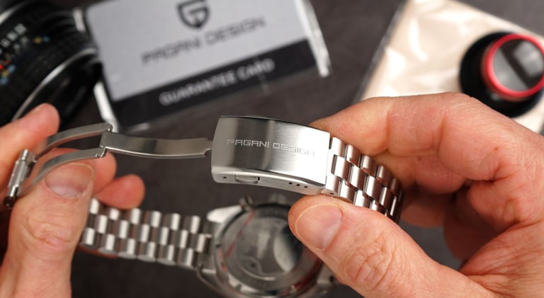
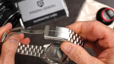
Now, moving on to the clasp — Very standard Pagani Design clasp here.
We’ve got a fold-over design, double pushers, it’s signed, and we get three micro-adjustment positions.
So yeah — very basic, but at this price point, absolutely no complaints.
We also get a diver’s extension… which, on a chronograph, I’m not entirely sure anyone really needs — but hey, it’s there.
Now, in terms of overall wearability — It wears really well. That slightly bulkier clasp actually helps balance out the lighter bracelet, so the watch feels nicely planted on the wrist. Very comfortable, very easy to wear — and overall, I think it just works.
Verdict
Now, in terms of the verdict — Well, as you might have already guessed… I definitely recommend this watch.
Because at this price point — it is absolutely undercutting pretty much all of the competition out there. Even the brands that play very aggressively in this space, like Watchdives, for example. And in terms of quality — Pagani Design is putting up a very decent fight here.
Now, yes — it’s not perfect.
The clasp with the diver’s extension… on a chronograph… a bit questionable.
The bracelet — maybe not the most refined in terms of how it feels and how it integrates with the case…
And of course — the usual Pagani Design story — lume could definitely be better.
But none of these are deal breakers. And aesthetically — they’ve absolutely nailed this CK2998-inspired look.
It looks great, it feels good, and it wears very comfortably. So going back to my question from the beginning… Does this bring Pagani Design back as the king of the budget homages? Well… I think it just might

Movement
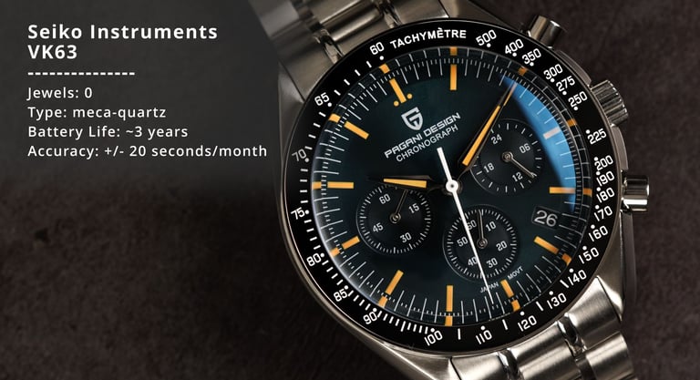
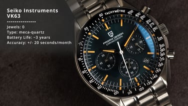
Right, so in terms of the movement that we’ve got here — it’s the VK63. If you've been watching my channel for a while you’re probably very familiar with this one. It's a Japanese calibre made by Seiko, and its claim to fame is that it’s a mecha-quartz — a combination of a quartz base with a mechanical chronograph module on top.
Which basically gives you the best of both worlds.
You get that smooth sweeping chronograph seconds hand, along with that very mechanical reset — that snap-back, almost flyback-style motion — which a lot of enthusiasts really like.
And then, of course, you’ve got all the benefits of quartz.
So we’re talking around three years of battery life, very solid accuracy, and overall excellent dependability.
And another advantage of this movement is that it’s relatively slim — which allows manufacturers to keep the case proportions nicely under control, without being constrained by a thicker, fully mechanical chronograph movement.


Explore
Discover expert watch reviews and industry insights.
Connect
Follow
© 2025. All rights reserved.